Monday 10 June 2013

Evaluation

Techniques and tools

Photography, Photoshop, Graphics Tablet, Flash, indesign, 


How successful is your artwork?

this is a comment I Revived from a fellow student:

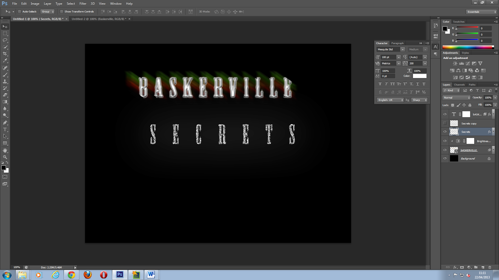
The concept for this artwork is very clear; it’s telling me that this artwork is for a scary game. The artwork helps set the atmosphere for a game that is creepy and scary, it looks as if the witting has been scratched and that this is telling you that there is something sinister awaiting you. This game is aimed at being a scary game and the menu screens, with the scratched text and dark imaging sends the right message that this game is going to be scary. I feel that the text and imagery works really well to create the right atmosphere, but I feel Bradley could have created the font himself to help his skill development.

I believe from this positive feedback that my Artwork really reflected what I was trying to portray, and so , yes, i think my artwork was successful

What would you change?

probably wouldn't change anything, but if I had too, I'd take my classmate's comment into mind and make the font myself.

Evaluate the effectiveness of one of your peers artwork on their blogs

I feel the effectiveness of the tutor feedback helped me a lot, for example at the start of the academic year I could work but I got distracted easily, and now i get less distracted and I'm much more on task with my work

Monday 29 April 2013

Game Menu Concepts #1

 Main Menu
 Stage selection
 Options menu
Extras menu


Reasons for the Font:

I chose this font because I feel that i wanted to have a "SLENDER" like Menu feel e.g.

Reference: http://uncyclopedia.wikia.com/wiki/File:Slender_pages.jpg 03/06/2013

(image taken from a YouTube video from the YouTuber Markiplier: http://www.youtube.com/user/markiplierGAME?feature=watch 03/06/2013
The video: http://www.youtube.com/watch?v=EKASMbGJR0Q) 03/06/2013
The Game: http://www.slenderarrival.com/ 03/06/2013

The font I used is called "Secret Labs" (not the same as the slender game), and i chose this because of it's classic sense of spine chilling uncertainty, and gives off a look as if a child wrote it, and I feel that a possessed demonic child is scarier than an adult in the similar situation. Although, the arrows and numbers in the concepts are actually made by hand, and the Photoshop steps I took to make them are extremely simple to recreate.

Font link: http://www.dafont.com/secret-labs.font 03/06/2013


Character Concepts

The Original Concept
Sonia Easton Concept Idea: 

figure and eye concept


I created this Concept figure from the concept drawings, in which turned out very nicely because of previous experiences with drawing Human figurines from scratch.

Then I Smoothed the Pixels out to give it a bit more of a smoother effect
then I added some colour the concept. In a way, to see what I'm working with
The next stage included smoothing out the image and colours, also adding the start of the facial features
Then I add some more facial features and some more smoothing, considering the fine details of the concept I decided to add some shading.
Then I added a bit more detail to the shading and I smoothed out the eye colouring as well and added a nose to the face, I also stopped the arm from looking like it was melting or something

The eye seemed to bee a bit too close to the hair line and so that kinda screwed up the face so I toned down the eye colouring from the hair, I also fixed up the figure of the concept to make it look less, pixelated. 


The Brief Bio:


Monday 22 April 2013

Typography Demo (Demo 4)

 first we started off by having the word Baskerville shortly after that we switched around the colours and stretched the wording using a motion Blur
 then we added another text saying Baskerville and place it over the already stretched word
 then i added the word secrets and gave it a outer glow and grew the size of it and lowered the opacity to give it a ghostly like effect
then i copied the Secrets layer and Flipped it, then i blurred it and stretched it to make it look more 3D


Monday 15 April 2013

Road Signs


Road signage can be in all different shapes and sizes . For example The Circular Speed limit signs of England and the Square Speed limit signs of america. But no matter what the signs look like they always seem to be really successful, I believe this is because the consequences that can be inforced and the problems it can cause.

Temporary signs such as these are for things such as accidents, roadworks, and Incidents that require bypassed traffic conditions. The colours in the signs are very different to other signs with it being yellow and black or plain red and white, this makes it so the driver is more alert about what is ahead.

Animal warning signs are there to prevent people from not being cautious and have the possibility of accentually hitting a kangaroo or some animal like that. once again the colours in this are yellow and black but not to draw attention, it's more about the landscape and how to make it easy to see.  


Information signs are usually around motorways telling you where and how many miles before a certain destination,
they are usually a large blue and white   board that is very noticeable to see.
Direction information is usually placed around roundabouts to show you what direction you should go, the colours are usually just blue and white, so pretty plain but still noticeable.
Warning signs are there to tell people that certain things are around, for example, the sign on the left is showing that is a "Children Crossing Zone". these are usually portrayed as a triangle  with a red outline and inside that is a white background with a black image. this is also seen as a warning.


Monday 11 March 2013

Lighting and Architecture

The theme I've chosen for lighting is the Infamously Brilliant "Lara Croft TOMB RAIDER". I've chosen this as my lighting because How incredible the Graphics and lighting are for example:

 Above The Latest Game of the series "TOMB RAIDER"        Reference: http://prowinwall.net/wallpaper/tomb-raider-9-hd/
Above the Earlier game "Lara Croft TOMB RAIDER Underworld". This image also represents Architecture as well as examples of light, as you can see the Ruins of ancient Temple with incredible detail, The Lead Environmental artist for "Tomb Raider: Underworld" "Daniel Newberger" Said that "the biggest Improvement was making the environment interact with the player". And the image above proves that The design team Seriously focused on that, and the main architecture of the game.

A good example of the Graphics in work can be found in the trailer By this link: http://www.youtube.com/watch?v=cF9efv6LMZs
Or Just simply watch it here:
Tomb Raider Has always been known for it's thrilling campaign, Dramatically Shifting storyline, and most of all there stunning Graphics:
Reference:
It's shading of light is also impressive, It hasn't seemed to have lost it since the game line had progressed games. Although this is defiantly more impressive, then again I wouldn't doubt that considering the game's exceeding Graphics level, Character development, and shading Graphics in environment design.

Monday 14 January 2013

Demo's 1,2,3

First we Added a Lens Flare to the main image, then we added a Blur effect, after we removed the main flare and replaced it with a Light source


Then we added a cloud effect and lowered down the opacity


 After we made the image a smart image we then got the brush tool lowered down the opacity of the brush and Darkened Certain areas that would look Realistic To be Dark at a night time mist look

then we added a Motion Blur effect to look like rain

Finally I perked the image up by Buring the Main Light beam into the image to seem more realistic.

as in extra I used the sponge tool and Dimmed down the sharpness again

This Demo image is different from the others in the class, for example The Grass wasn't used in the main demo image and the same with the  Demo image and the burn tool on the bottom of the house wasn't used ether  I like this image because it truly Represents  the spooky feel it's supposed to give off.


First We Had These  Images To work from:


Then We Created an floating island effect Using the clone tool and Channels

with this image we also Gave a water Running off a cliff effect using Channels and Copy and pasting

 Then we added it To an image that was made in the last demo, where We created a similar floating island
 The floating island with shadow ^
 The Island that we worked on today was then added to the Image
 We Duplicated the island image and flipped it, Then gave it a carven Look in the bottom left
This was an Image Manipulated from an image that I took from the main Photo shoot

Monday 7 January 2013

Photo shoot

Annotations should include


colour
shading
Textures
form / shape
Depth of field / Compositions
Foreground
Focus
Typography
Future of use within game